 木の向くままのエンジニア
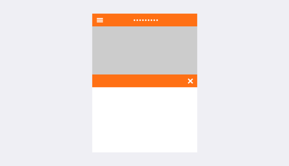
クリックできる目次
はじめに
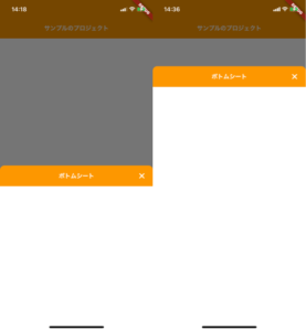
こんにちは。普段iOSで利用するような present(_:animated:completion:) のModal遷移をFlutterでも実現させたくなりました。イメージは以下のような感じです。
ソースコード
|
1 2 3 4 5 6 7 8 9 10 11 12 13 14 15 16 17 18 19 20 21 22 23 24 25 26 27 28 29 30 31 32 33 34 35 36 37 38 39 40 41 42 43 44 45 46 47 48 49 50 51 52 53 54 55 56 57 58 59 |
/// BottomSheetを表示する void showBottomSheet(BuildContext context) { showModalBottomSheet( context: context, isScrollControlled: true, backgroundColor: Colors.transparent, builder: (context) => Container( height: MediaQuery.of(context).size.height * 0.8, child: Column( children: [ Container( height: 56, decoration: BoxDecoration( color: Colors.orange, borderRadius: BorderRadius.only( topLeft: Radius.circular(12.0), topRight: Radius.circular(12.0), ), ), child: Stack( children: [ ConstrainedBox( constraints: BoxConstraints.expand(), child: Row( mainAxisAlignment: MainAxisAlignment.end, children: [ IconButton( icon: Transform.rotate( angle: 45 * pi / 180, child: Icon(Icons.add, size: 30, color: Colors.white)), onPressed: () { Navigator.pop(context); }, ), SizedBox( width: 6, ) ]), ), Center( child: Text('ボトムシート', style: TextStyle( fontWeight: FontWeight.bold, color: Colors.white, fontSize: 16)), ) ], ), ), Expanded( child: Container( color: Colors.white, ), ) ], )), ); } |
使い方
以下にそれぞれのカスタマイズの方法を書いていきます。
上側のTabBarのデザインの設定
|
1 2 3 4 5 6 7 8 9 10 |
Container( height: 56, decoration: BoxDecoration( color: Colors.orange, borderRadius: BorderRadius.only( topLeft: Radius.circular(12.0), topRight: Radius.circular(12.0), ), ) |
heightでTabBarの高さ
BoxDecorationでiOSのModalのデザインになるように角丸を
colorで擬似NavigationBarの色をそれぞれ設定しています。
BottomSheet画面の高さの設定
|
1 2 3 |
// 大元のContainerの大きさを決めている。 height: MediaQuery.of(context).size.height * 0.9, |
デバイスサイズの0.9倍に設定しているので、ここで0.5などを設定するとデバイスのちょうど半分の大きさになります。
注意
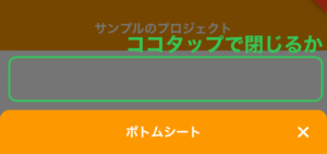
showModalBottomSheetのisScrollControlled: true,を書かないと高さを変えることが出来ません。BottomSheet以外の暗い部分をタップで閉じるかどうかの設定
|
1 |
isDismissible: false, |
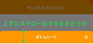
BottomSheet自体を触って閉じるかどうかの設定
|
1 |
enableDrag: false, |